
Mastering an efficient photo editing workflow transforms chaotic image management into a streamlined creative process. This comprehensive guide walks you through a systematic 10-step approach from initial import to final export, helping photographers save time while maintaining quality. Discover how proper organization, batch processing, and strategic editing techniques can revolutionize your digital photography workflow.
Strategic Import and Organization
The journey to a stunning final image begins not with a slider, but with a disciplined and strategic import. This foundational step transforms a chaotic dump of files into a manageable, searchable library, setting the stage for every subsequent action. A haphazard import guarantees future frustration, while a systematic one pays continuous dividends in saved time and reduced stress.
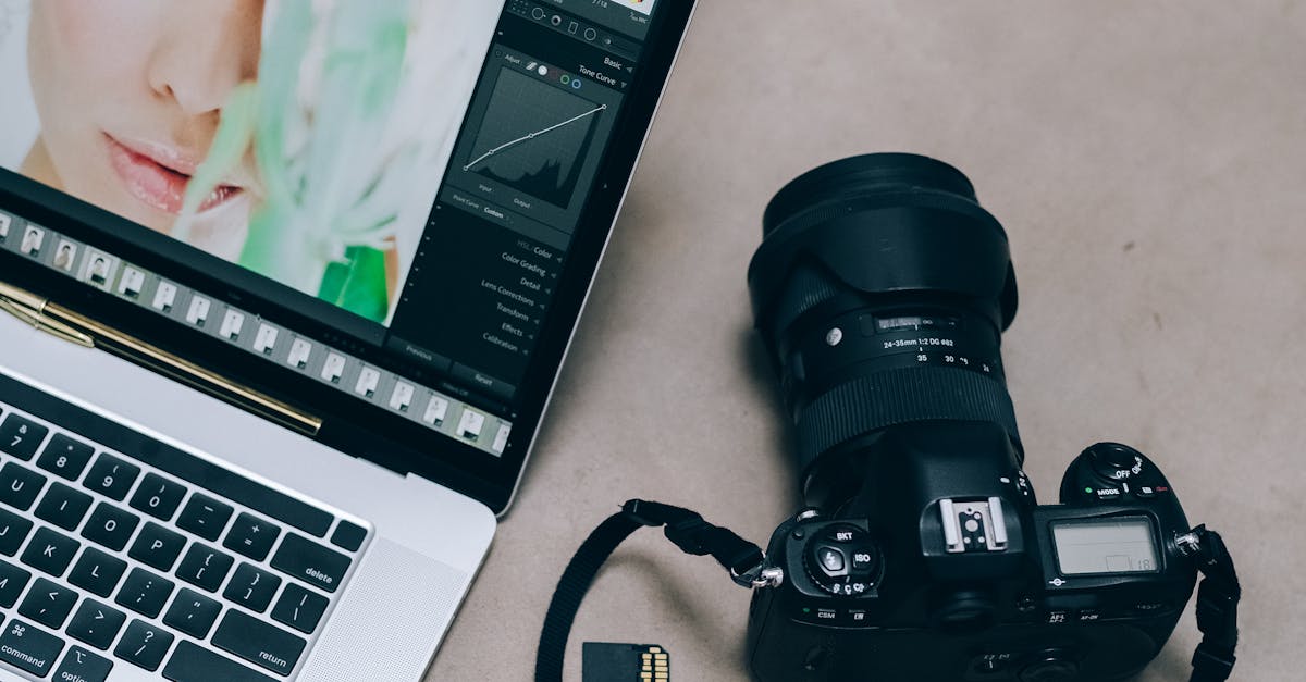
Begin by physically transferring images from your memory card to your computer using a dedicated card reader, which is faster and more reliable than a direct camera connection. Before any files move, however, open your chosen management software, such as Adobe Lightroom. Its import module is a control center: it allows you to choose a source, but more critically, it lets you define the destination and apply rules automatically. Here, you establish your organizational backbone. Create a primary folder structure that makes sense for your work—by date (e.g., 2024-10-26_ClientName), by project type, or by client. Consistency is key. Immediately implement a file naming convention that goes beyond the camera’s default sequence, incorporating dates, shoot names, or your initials.
During import, leverage the software’s ability to add metadata. Embedding your copyright information and basic contact details is non-negotiable for professional work. This is also the ideal moment to apply a broad keyword or two that describes the entire shoot (e.g., “New York Skyline,” “Johnson Wedding”). Most importantly, configure your import to copy files to two separate locations simultaneously—your primary working drive and a backup drive. This is your first and most crucial backup, protecting against card corruption or transfer errors. Lightroom’s “Copy as DNG” option can also convert raw files to the open DNG format, potentially saving space and ensuring long-term readability.
Once imported, resist the urge to start editing. First, perform a quick visual scan in the Library module. Use the Painter tool or batch functions to add more specific keywords and assign a preliminary rating or color label to obvious standout shots or rejects. This initial tagging and organizing creates a powerful, filterable database. You will never waste time searching for “that one portrait”; you’ll simply filter by the client’s name, a five-star rating, and the keyword “portrait.” By investing minutes here, you save hours later, ensuring that when you proceed to the culling phase, you are working within a clean, structured, and secure library of your images.
Initial Culling and Selection Process
Following the strategic import and organization of your images, you now face the raw material of your shoot. The initial culling and selection process is the critical gatekeeper of your workflow, where decisive action saves hours of wasted effort later. This is not about editing; it is about making swift, judgmental choices to isolate the very best frames from the multitude.
Begin by reviewing your organized collection in a thumbnail view. This broad perspective allows for instant rejection of technical failures: blatantly out-of-focus shots, completely missed flashes, or accidental shutter presses. Use your software’s rejection flag or shortcut to mark these for deletion immediately. Next, employ the compare or survey view to evaluate similar compositions side-by-side. Zoom to 100% to check critical focus on the eyes in portraits or key details in landscapes. This two-pass method—first for obvious rejects, then for comparative quality—rapidly pares down the batch.
Establishing a consistent rating system is paramount. A simple yet effective method is:
- Use a Pick flag for immediate, obvious selects.
- Apply a one-star rating
- Use two stars for the strongest candidates that will definitely proceed to editing.
Color labels can add another layer, like marking images for different deliverables (e.g., client previews, black and white conversion).
Your criteria will shift based on the scenario. For a portrait session, prioritize sharp focus on the eyes and genuine expression. For an event, you must ensure coverage of key moments and participants. For landscapes, it’s about optimal light and composition. By ruthlessly culling now, you create a curated shortlist. This means the upcoming phase of global adjustments and batch processing will be applied only to images worthy of your time, transforming a potentially overwhelming edit into a manageable and focused enhancement of your best work. This disciplined selection is the cornerstone of an efficient creative process.
Global Adjustments and Batch Processing
Having efficiently culled your collection to the strongest images, you now face a series of foundational corrections that nearly every photo requires. This is the stage of global adjustments—edits applied to the entire image. When working with a set of photos from the same environment, applying these corrections individually is inefficient. Instead, harness the power of batch processing and synchronization to establish a consistent baseline across all similar images.
Begin by selecting a representative “hero” image from a series shot under identical lighting, such as a sequence from a portrait session or a landscape panorama. Apply your essential global adjustments non-destructively, meaning your original data remains untouched, and edits are stored as a set of instructions. Key adjustments include: exposure correction to set the overall brightness, white balance calibration to neutralize color casts, and enabling lens profile corrections to automatically fix distortion and vignetting. This is also the ideal moment for initial basic color grading using the tone curve or HSL sliders to establish a cohesive mood.
Once your hero image is tuned, you can synchronize these settings across all selected images from that scene. In software like Lightroom or Capture One, use the “Sync” function, carefully choosing which settings to apply. This is where efficiency soars. For maximum consistency, you can save this combination of adjustments as a custom preset tailored to that specific shooting condition—like “Indoor Studio Flash” or “Golden Hour Landscape.” Applying a preset becomes your one-click starting point for future imports from similar shoots.
Batch processing is most effective for images with shared characteristics. A wedding reception, a product shoot with consistent lighting, or a real estate tour are perfect candidates. However, the key is balance. After synchronizing, you must review each image individually. A group photo may need slightly different exposure than a close-up, or a white balance shift may affect skin tones differently. The goal of this stage is not to finish the edit, but to efficiently elevate the entire batch to a clean, corrected starting point, setting the stage for the precise, localized enhancements that will follow.
Targeted Localized Editing Techniques
With your global adjustments establishing a solid foundation, the next critical phase is targeted localized editing. This is where you move from correcting the entire image to sculpting light, directing attention, and solving specific problems within distinct areas. The core tools for this are localized adjustment tools: the Adjustment Brush, Graduated Filter, and Radial Filter. Each allows you to “paint” or “place” corrections—like exposure, contrast, or color—onto selected portions of your photo, leaving the rest untouched.
Mastering these tools transforms your workflow. For portraits, use a subtle Radial Filter with negative exposure to gently darken distracting backgrounds, making your subject pop. Employ a low-flow Adjustment Brush for dodging (lightening) and burning (darkening) to accentuate facial contours or hair highlights, a technique far more nuanced than global contrast. In landscapes, a Graduated Filter can recover a blown-out sky while a separate brush enhances the texture on a foreground rock. For product photography, a precise brush allows for selective sharpening on a logo or targeted saturation boost on a key product feature, ensuring it captures the viewer’s eye.
The true artistry lies in balancing these local adjustments with the image’s overall harmony. It’s easy to overdo it. Always zoom out to 100% view after making a localized edit to ensure it integrates seamlessly. Common pitfalls include creating obvious “halos” around adjusted areas or making colors that no longer match the scene’s palette. The goal is to guide the viewer’s journey through the image subtly, not to announce your edits. Whether you’re calming a chaotic background, compensating for uneven lighting on a subject, or enhancing a specific object, each localized adjustment should serve the photograph’s singular vision, setting the stage for the advanced color and creative effects to come.
Advanced Color Correction and Creative Effects
Having mastered the art of localized adjustments, we now elevate the entire image through Advanced Color Correction and Creative Effects. This stage transcends technical fixes, entering the realm of artistic interpretation where color becomes narrative and texture adds emotion. While the previous chapter focused on where to edit, this chapter is about how you see and feel the final image.
Sophisticated color grading begins with understanding color relationships. Use the HSL (Hue, Saturation, Luminance) panel for surgical control, like shifting all blues toward teal or isolating and desaturating distracting colors. The true power, however, lies in the color wheels. Use the shadows, midtones, and highlights wheels not just for white balance, but to inject mood—adding subtle cyan to shadows and warmth to highlights creates cinematic depth. Split toning extends this, allowing you to tint shadows and highlights with complementary colors, a classic technique for cohesive, stylized looks. To ensure visual coherence across a series, create a preset from your first perfected image, applying it as a base to all subsequent photos and adjusting only for individual lighting variances.
Creative effects are the final signature. Strategic grain can impart an organic, filmic quality, while a subtle vignette gently guides the viewer’s eye. Texture overlays, used with discretion, can add a tactile dimension. The key is restraint; effects should support, not overwhelm, the image. This entire process is where your personal style crystallizes. It’s a balance between pushing creative boundaries and maintaining a natural integrity—the difference between an image that looks edited and one that feels evolved. Your style emerges from consistent choices in color palette and effect application, creating a recognizable thread through your work. This artistic layer, built upon a solid technical foundation, prepares your visually cohesive images for their final journey to export and delivery.
Optimized Export and Delivery Systems
With your creative vision fully realized through color grading and effects, the final critical phase is delivering your work in its best possible form. An optimized export and delivery system ensures your artistic intent survives the journey from your screen to its final destination, whether that’s a glossy magazine, a social media feed, or a client’s archive. This process is not a one-size-fits-all step, but a strategic decision based on the output medium’s technical requirements.
For web and social media, the universal standard is sRGB color space and JPEG format. Platforms compress uploaded images aggressively, so you must pre-optimize. Export at the exact pixel dimensions needed—often 2048px on the long edge for general web, or specific sizes like 1080x1350px for Instagram. Use a JPEG quality setting between 70-85% to find the sweet spot between visual fidelity and small file size. For print production, consult with your lab. They typically require full-resolution TIFF or high-quality JPEG files in Adobe RGB or ProPhoto RGB color spaces to preserve the wide gamut you carefully crafted, with a minimum of 300 PPI at the final print dimensions.
Efficiency is key. Use batch export presets to generate multiple versions from a single master file. Create one preset for a print-ready TIFF, another for a web-sized JPEG, and a third for a watermarked social media version. Embedding copyright metadata is non-negotiable for professional delivery; subtle watermarking can be added for client proofs. When organizing, create a clear folder structure for each delivery purpose, such as Final_Exports/ClientName/Web_Gallery. This systematic approach guarantees you deliver the right file, for the right purpose, every time, protecting the quality and integrity of the work you so meticulously created in the previous stages.