
In the competitive world of property staging, tight spaces present unique challenges that can make or break a sale. This article reveals professional secrets for correcting perspectives and creating the illusion of spaciousness through strategic design techniques. Learn how to transform cramped rooms into inviting, expansive-feeling spaces that captivate potential buyers and maximize property value.
Understanding Spatial Perception in Interior Design
Our perception of space is not a simple measurement; it is a complex psychological interpretation built from visual cues. The brain constantly assembles a sense of dimension and volume from light, lines, and contrast, often before we consciously register a room’s true size. This is why two rooms with identical square footage can feel profoundly different. Key psychological triggers include ceiling height, where vertical lines draw the eye upward, creating an impression of airiness, and open sightlines, which allow the eye to travel unimpeded, signaling freedom and flow. Conversely, low ceilings, obstructed views, and visual clutter send signals of confinement, triggering a subtle, often subconscious, desire to escape.
This process is rooted in principles of forced perspective, a technique borrowed from architecture and theatrical set design that manipulates these very cues to alter perceived depth and scale. It exploits how our brains interpret parallel lines converging (like a long hallway) or judge an object’s size based on its surroundings. In interior design, we don’t build false walls, but we strategically deploy elements that mimic these optical phenomena. The goal is to suggest spaciousness by leading the gaze on a longer, more engaging journey through the environment. Understanding this psychology is the stager’s first secret: we are not decorating a static space, but actively directing a viewer’s spatial narrative, using their own perceptual wiring to craft an experience of openness and possibility where literal dimensions are limited.
The Science of Forced Perspective for Small Rooms
Building on how our brains interpret spatial cues, we move from theory to applied science. Forced perspective, a technique borrowed from theatrical set design and monumental architecture, is the deliberate manipulation of visual cues to create a false sense of depth and distance. In a small room, this becomes a powerful tool to stretch perceived boundaries.
The core principle is convergence. Our brains assume parallel lines, like those of a floorboard or a rug pattern, will converge as they recede into the distance. By angling a large area rug or laying flooring on a diagonal, you create dynamic lines that pull the eye toward the farthest corner, artificially extending the room’s length. Similarly, strategic artwork placement employs this trick. A large, single-piece artwork with a deep vanishing point, like a path through a forest, placed on the main focal wall, can create an immersive illusion of a window into a larger world.
Depth manipulation is further achieved through strategic layering and tonal gradation. Professional stagers often employ a value scaling technique: using darker, more saturated colors on elements closest to the viewer and progressively lighter, cooler tones on walls and furnishings farther away. This mimics atmospheric perspective, where distant objects appear lighter and less distinct, making the back wall feel farther away. In a narrow hallway, painting the end wall a slightly lighter shade than the side walls can make it feel more recessed. The goal is not to disguise the room’s size, but to systematically guide the eye through a sequence of cues that suggest expansive space.
Strategic Furniture Placement and Scaling
Building on the principle of forced perspective, the physical arrangement of furniture is where theory meets tangible reality. In tight spaces, every piece must earn its place. The cardinal rule is scale. Oversized furniture is a spatial killer. Opt for pieces with slender profiles, exposed legs that allow light to pass underneath, and lower heights that keep sightlines open. A loveseat often serves better than a full sofa; a round pedestal table prevents harsh corners and improves flow.
Resist the instinct to push all furniture against the walls. This often creates a hollow, uninviting center and emphasizes the room’s perimeter. Instead, float key pieces. A sofa pulled a few feet from the wall, with a slim console behind it, instantly creates depth and multiple functional zones. This technique, a direct application of depth manipulation, makes the room feel layered rather than flat.
Clear, unobstructed pathways are non-negotiable. Arrange furniture to create obvious circulation routes, ideally forming a natural loop. This encourages movement and makes the space feel navigable and generous. Prioritize multi-functional items—an ottoman with storage, a nest of tables, a sleeper sofa—to reduce clutter. The goal is to define purpose without congestion, allowing the eye to travel smoothly around the room, which seamlessly sets the stage for the next spatial tool: the strategic use of color.
Color Psychology and Spatial Illusion
Following the strategic placement of furniture, the next powerful tool in the stager’s arsenal is color. While furniture defines physical boundaries, color manipulates perception on a psychological and visual level. The science is rooted in how light wavelengths interact with our eyes and brain. Lighter, cooler hues like soft blues, greens, and pale grays are receding colors; they appear to pull away from the viewer, making walls seem farther apart. Conversely, warm, dark tones are advancing colors, absorbing light and making surfaces feel closer and more intimate.
To maximize spaciousness, a monochromatic scheme is exceptionally effective. Using varying tones, tints, and shades of a single color eliminates visual choppiness and creates a seamless flow that the eye travels effortlessly across, making the room’s dimensions harder to gauge. Within this scheme, strategic accent placement is key. Painting ceilings a bright white or a lighter tint than the walls draws the gaze upward, emphasizing vertical space. Similarly, a single, carefully chosen focal point—like a piece of art on the far wall—uses color to create depth, pulling the viewer’s attention into the distance.
Remember, the goal is to use color to extend the visual field, not segment it. This means continuing wall colors into trim and even onto the ceiling in some cases to blur edges. Light-reflective paints with a satin or eggshell sheen further amplify this effect by bouncing available light around the room, a perfect segue into the next critical layer of illusion: strategic lighting.
Lighting Techniques to Expand Visual Space
While color sets the stage for spatial perception, lighting is the director that brings the illusion to life. It is the critical tool for manipulating shadows and highlights to stretch boundaries and dissolve corners. The goal is not simply to flood a room with light, but to craft a layered lighting scheme that illuminates uniformly, eliminating the dark, cavernous pockets that shrink a space visually.
Begin by maximizing natural light, your most valuable asset. Ensure windows are spotless and use sheer, light-filtering window treatments to diffuse light without blocking it. Then, build your artificial layers. Ambient lighting, often from recessed ceiling fixtures or a central source, provides the foundational wash. Crucially, pair this with strategic task and accent lighting. Uplighting, such as floor lamps that cast light upward toward the ceiling, literally draws the eye up, making walls appear to recede. Placing slim LED strip lights under cabinets or along toe kicks adds a floating effect, enhancing the sense of volume.
The placement of light sources is more important than their brightness. Avoid a single, harsh overhead light that creates sharp, space-shrinking shadows. Instead, distribute multiple lower-wattage sources around the room’s perimeter. Illuminate dark corners specifically, as they visually collapse a room’s dimensions. Use mirrors, a topic we will expand on next, opposite light sources to double their impact, bouncing light deep into the space. The result is an evenly illuminated, shadow-minimized environment where surfaces glow, boundaries soften, and the room feels effortlessly airy and expansive.
Mirror Magic and Reflective Surfaces
Building upon a foundation of layered lighting, the strategic use of mirrors and reflective surfaces is a stager’s most powerful tool for physically altering perceived space. The principle is rooted in physics: a mirror doesn’t just reflect light, it replicates the room’s visual information, effectively doubling the depth and volume within its frame. This creates a genuine optical illusion of extended space, tricking the brain into registering a boundary that isn’t truly there.
Placement is critical. Position mirrors to reflect a room’s best feature, like a window with natural light, effectively borrowing and multiplying that outdoor vista. Avoid reflecting cluttered corners or tight passages. For correcting perspective in narrow rooms, place a large mirror on the farthest short wall to seemingly push it back, or on a long wall to create width. Sizing matters immensely; a mirror must be substantial enough to create a convincing vista, not just a fragmented glimpse. Framing should be minimal or non-existent to allow the reflection to seamlessly blend with the actual space, enhancing the illusion.
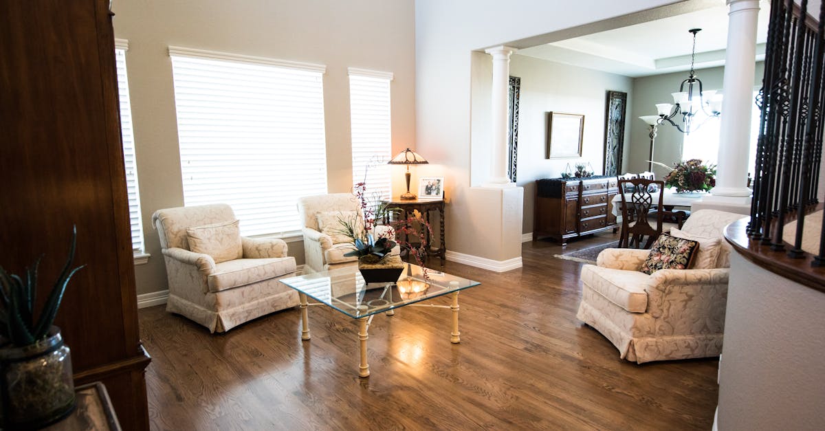
Beyond mirrors, incorporate other reflective elements to amplify light and depth without creating a hall-of-mirrors effect. Glass tabletops, high-gloss kitchen cabinets, metallic lamp bases, and polished nickel fixtures all catch and scatter light. Even a high-sheen satin paint on trim or ceilings can subtly bounce illumination around. The goal is a layered reflectivity that works in concert with your lighting scheme, ensuring the space feels luminously expanded, not stark or visually chaotic. This careful orchestration prepares the eye for the next strategy: drawing attention upward to exploit vertical dimensions.
Vertical Expansion Strategies
While mirrors, as discussed, manipulate depth horizontally, the next frontier in spatial deception is the vertical plane. In rooms with low ceilings or a squat footprint, the goal is to break the eye’s horizontal journey and pull it skyward, creating an illusion of lofty height. This vertical expansion is achieved by masterfully manipulating lines, treatments, and focal points to emphasize the room’s tallest dimension.
The most powerful tool is the intentional creation of vertical lines. This begins with architectural treatments: installing floor-to-ceiling curtains, hanging them several inches above the window frame to extend the line, and letting them pool slightly on the floor. Similarly, tall, narrow bookcases or vertical shiplap paneling on walls force the gaze upward. Strategic artwork placement is crucial; a single large, vertically oriented piece or a carefully arranged column of smaller frames is far more effective than a horizontal spread. The color strategy also shifts; painting walls, trim, and ceilings the same light color eliminates horizontal breaks, while a contrasting ceiling instantly lowers the space.
Professional stagers understand that perception is governed by comparison. By furnishing a room with lower-profile seating and avoiding tall, horizontal headboards or wide artwork, the remaining wall space feels vast by contrast. Even lighting contributes: using uplights, tall floor lamps, or vertical sconces draws light upward. The cumulative effect of these techniques is a recalibrated sense of proportion. The room no longer feels like a box but a dynamic space where the vertical dimension is celebrated, creating a more balanced and aspirational atmosphere that feels inherently larger.
Creating Flow and Continuity Between Spaces
Having mastered the vertical dimension, we now turn to the horizontal plane, where the true magic of perceived space unfolds. A room can feel tall yet still be claustrophobic if it feels cut off from its surroundings. The professional’s next secret is to create flow and continuity between spaces, crafting a visual journey that encourages the eye to travel freely, thereby expanding the sense of square footage beyond physical walls.
The foundation of this strategy is unwavering consistency. Maintain the same flooring material and color throughout adjacent areas; a sudden shift from dark wood to light tile acts as a visual full stop. Extend a cohesive, light-reflective color palette across walls, using varying shades of the same hue to define spaces without creating jarring contrasts. Repeat key design elements—like matching trim, light fixture finishes, or a consistent style of furniture legs—to create a rhythmic visual connection. This repetition signals to the brain that these are connected parts of a whole, not isolated boxes.
Architectural limitations often hinder true open-concept flow, but strategic staging can mimic it. First, maximize critical sight lines. Position key furniture, like a sofa, to face an opening into another room, not a solid wall. Ensure the view from the primary entrance captures a diagonal sightline across multiple spaces, which feels inherently more expansive. Ruthlessly eliminate visual barriers. Replace heavy, opaque room dividers with open shelving or transparent furniture. Keep doors open during showings to physically and visually link rooms. The goal is to create a narrative of space where one area gracefully introduces the next, making the entire property feel like a unified, flowing expanse rather than a series of cramped compartments.
Decluttering and Visual Breathing Room
Following the establishment of visual flow, the next critical step is to clear the stage. Visual clutter is the enemy of perspective, acting as a series of tiny, chaotic focal points that halt the eye and fracture the sense of space. Each extraneous item creates psychological crowding, signaling to the brain that the room is full, even if square footage remains. The goal is not sterile emptiness, but intentional minimalism that creates visual breathing room—a canvas upon which spatial illusions can be painted.
Professional stagers employ ruthless editing, asking not what a room needs, but what the story of the space requires. This involves:
- Vertical Decluttering: Clearing countertops, mantels, and windowsills to emphasize horizontal lines and uninterrupted surfaces.
- Focal Point Fortification: Removing competing elements to strengthen a single, room-expanding feature, like a fireplace or a window with a view.
- Contained Necessities: Using built-in or strategic storage with clean lines to hide daily items, ensuring nothing disrupts the calm visual plane.
The balance is key: a single, well-placed art piece on a wall has more impact than a gallery cluster. Necessary furniture should float away from walls where possible, and every object kept must earn its place by contributing to an impression of abundant, serene space. This curated openness is the foundational layer for the advanced optical techniques to follow.
Advanced Professional Staging Techniques
Having mastered the foundational art of decluttering, the professional stager moves into the realm of active spatial manipulation. This advanced phase involves combination strategies, where multiple illusion methods are layered for cumulative impact. For instance, in a narrow dining room, we might employ a vertical stripe rug to elongate the floor, paired with a diagonally placed console to break the boxy sightlines, and a large mirror strategically angled to reflect a window from an adjacent room. Each technique reinforces the other, creating a powerful, cohesive illusion of width and depth.
Technology now plays a pivotal role. Top stagers use augmented reality apps to visualize furniture placement and wall treatments in real-time, avoiding costly trial and error. Laser measures and 360-degree cameras allow for precise planning of sightlines, ensuring that every staged vignette contributes to the corrected perspective from key entry points. A recent case involved a long, tunnel-like studio apartment. The tailored plan used a gradated paint technique (darker at the entry, lighter at the far end) to visually “pull” the back wall forward, while a multi-level lighting plan with bright task lighting in the rear eliminated shadowy depth. The transformation was not a single trick, but a calculated symphony of color, line, and light.
Maintaining these illusions during showings is critical. We create a showing protocol that dictates which lights must be on, which window coverings adjusted, and even the recommended path for viewers to follow. The goal is to control the narrative of the space, guiding the eye through the crafted perspective so the illusion holds, and the property feels not just staged, but fundamentally more spacious.